To begin, I collect all the Senate-approved curriculum changes and course additions, deletions, and modifications. I modify the catalog text accordingly. I also read the front matter and faculty/staff listings for other changes that have occurred on campus during the year. Then, I send a proof to the campus community for review. The pages come back marked up in red with more changes.
I make the additional changes and then proofread, double check, triple check. I send this to the printer and then read the blueline proof carefully. Some would call this an incredibly tedious task. And it is. But it is also incredibly important, so I do enjoy it.
For the past several years, summers have been an overwhelming time in the Publications Office: the undergrad and grad catalogs, the telephone directory, newsletters, and more all demanded attention. Last fall, however, a new employee joined me and I have had more time for some long-neglected tasks. I took the time this year to update the font, column width, and header styles of the catalog. So, in additions to the tedious editing tasks, I also reformatted every line of the catalog.
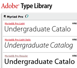
I like the updated look. The 1950s Optima font has been replaced with the easy-on-the-eye sans serif font Myriad. The bloated columns have trimmed down and stand farther apart. The top margin has been widened for more white space—the page, I hope, will be more relaxing to the reader (prospective students and their parents, who have enough anxiety).
Optima, designed by Hermann Zapf in 1958, is very clean and crisp, but tends to be a bit sterile. Its popularity for use in newsletters, brochures, and advertising copy makes it a bit overused for the past 30 years. Still, for its time, it was a stylistic triumph.
The switch to Myriad, designed in 1992 by Twombly and Slimbach of Adobe Systems, represents a movement away from an institutional look for the catalog to a more friendly, personal style. I use Myriad for the schedule of classes and many other publications. I have Myriad Pro, which provides a wide variety of weights—so I am able to use it for heads and body text. I think it has a simplicity with flair and substance. It also is very well kerned and doesn't pose any problems in intricate combinations of letters and numbers. It is the perfect fin de siecle font!

1 comment:
Good choice. And I appreciate the thought behind it. Not just another "Oh, because I liked it" design decision.
Tom
Post a Comment